Two Briefs, One Idea
FINRA's two asks looked unrelated: an accessibility guide for its own teams, and a risk tool for first-time investors. Underneath, they were the same problem.
The first brief came from inside FINRA. Its product teams wanted to build accessibly, but WCAG arrived as dozens of technical criteria, usually late and usually on a designer's desk. The second came from FINRA's novice-investor initiative, which had found that young people were making money decisions without understanding their own tolerance for risk.
Both were failing people in the same way. Accessibility guidance assumed every project started perfectly, with a designer in charge. Risk tools assumed every investor was already confident, then labelled the ones who weren't. Each asked people to begin somewhere they weren't. So we built both deliverables on one idea: meet people where they are, whatever their role, their project's stage or their comfort with risk.
0
SCAD students across two parallel tracks
0
deliverables: an accessibility guide and a risk tool
0
weeks from kickoff to the final readout
2,500+
data points from interviews and surveys
Problem Statement
FINRA's teams were handed accessibility as a late, designer-only checklist, and young investors were handed risk profiles that judged them. Both deliverables had to start from where people actually were, not where an ideal process expected them to be.
Two Tracks, One Lead
Nineteen people, two very different deliverables and one client. The first job was making sure they added up to one body of work.
We split into an Accessibility team and a Risk team, each focused on its own deliverable. Above them sat four leads whose roles spanned both tracks: project, research, visual and experience design. As experience design lead I owned how each deliverable would feel to the people using it, which meant one set of decisions about tone, structure and interaction ran through everything.
- Accessibility Guidelines website
- Building Accessibility into Your Workflow, a training deck
- Risk Tolerance Tool for novice investors
- Five risk archetypes

Where People Actually Start
We researched both audiences the same way: by asking where they really begin, not where they're supposed to.
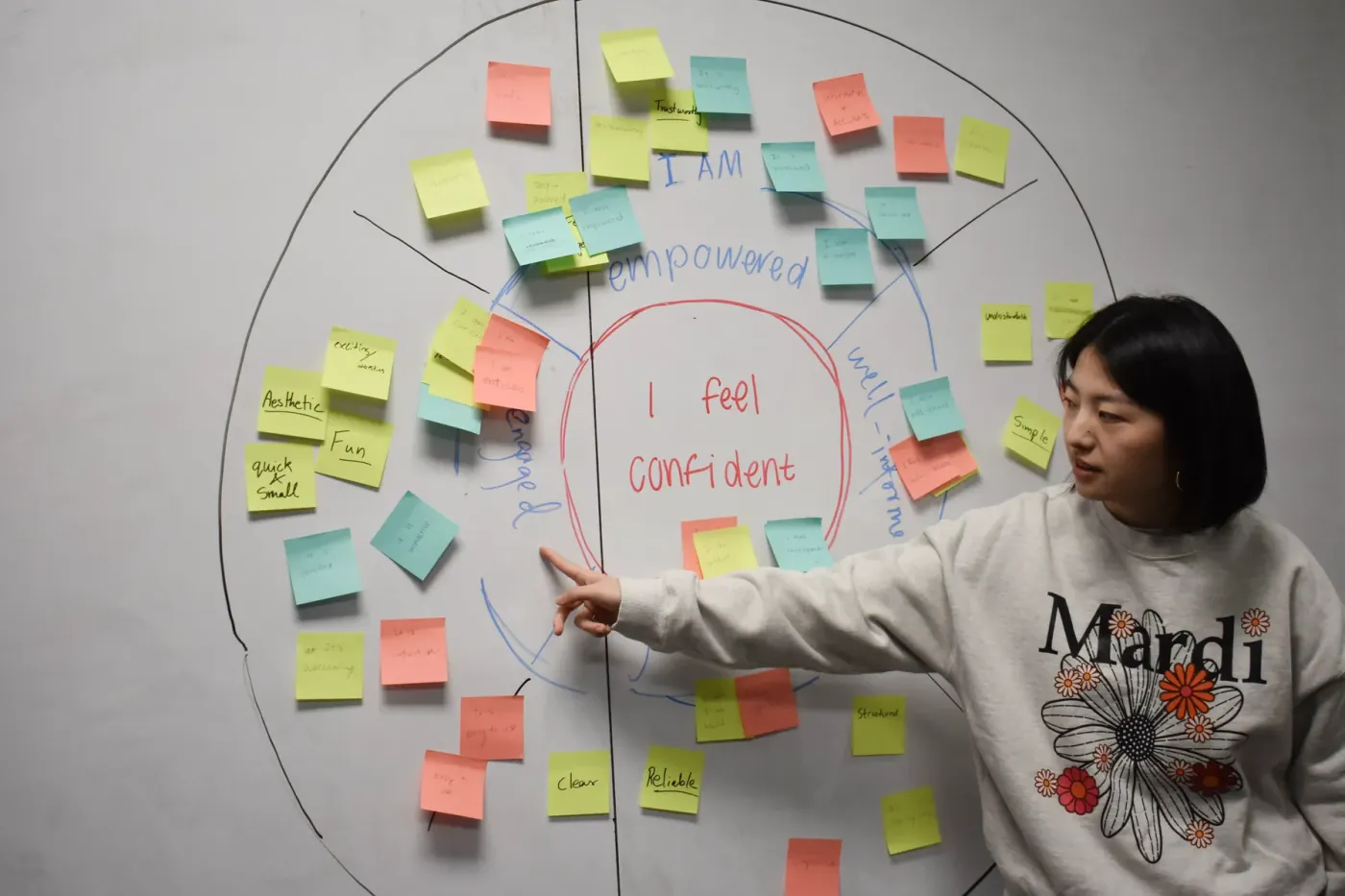
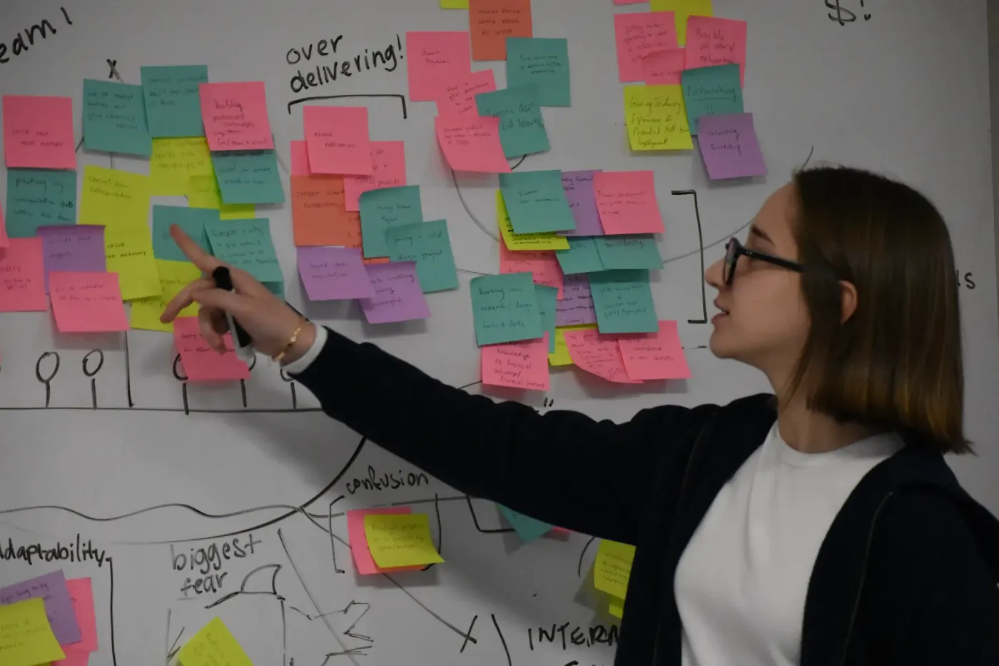
The Accessibility team interviewed twelve designers, engineers and product people, ran a concept survey and card-sorted what a guide should contain. The Risk team surveyed 109 young investors, held moderated interviews and ran a sensory cue workshop. More than 2,500 data points went through the Lextant Ideal Experience framework, so every insight was tied to a feeling we wanted people to have, like "I am confident."
The Guide: Accessibility Arrives Late
One survey question told the story. Teams paid most attention to accessibility in high-fidelity design and testing, much less in early design, and least of all in the first conversations with stakeholders, exactly when it costs the least. A guide that only worked if you started right would miss most real projects.
When Teams Consider Accessibility
It Arrives Too Late
Accessibility was usually picked up in late design or testing, when fixing it meant costly rework.
It Lands on Designers
Engineers, PMs and QA relied on self-research or mentors, because nothing spoke to their part of the work.
There's No Single Source
Teams wanted one place for principles and a plain breakdown of WCAG criteria, for beginners and experts alike.
The Risk Tool: Willing, but Unsure
Young investors weren't reckless. Most wanted to invest, but they didn't trust what they knew, leaned on family and social feeds for advice, and found financial language built to exclude them. Existing risk quizzes made it worse by sorting people into labels that sounded like verdicts.
- Emotional, short-term decisions
- Jargon that overwhelms beginners
- Advice from family, feeds and forums
- Risk only understood after a loss
Meeting People Where They Are
The same principle came out of both tracks. The work was turning it into structure people could actually use.
The Guide: Every Role, Every Stage
Accessibility is a team outcome, so the guide is written for the team. Every guideline breaks down into what management, design, development and QA each contribute, so a developer never has to translate a designer's checklist and a PM can see what to plan for.
Write for the Whole Team
- Decision
- Organise every guideline by role, with specific actions for management, design, development and QA, instead of a designer-facing checklist.
- Trade-off
- Four times the content to write and keep consistent, and a structure every role had to recognise.
- Why
- When accessibility belongs to one role, everyone else assumes it's handled. Naming each role's part makes it shared.
The second idea came straight from the survey. Instead of one ideal path that only works from day one, the guide has an entry point for every stage: plan, design, develop, launch and verify. Each tells a team what's still possible and what to do first. Starting late still means starting. Pick a role and a stage below.
The Guide Explorer
Bring accessibility in from here.
Mid-flight. Fix what users hit first, then build the habit.
- Answer developer questions on states and labels
- Annotate whatever was missed, without redesigning
Meet Teams Where They Are
- Decision
- Give the guide an entry point at every project stage, with what's still possible and what to prioritise, instead of only describing the ideal start.
- Trade-off
- A more complex structure, and honest guidance about what late fixes can and can't recover.
- Why
- Most projects find accessibility mid-flight. A guide that only works from the start would quietly be ignored by most of them.
The Risk Tool: Characters, Not Judgments
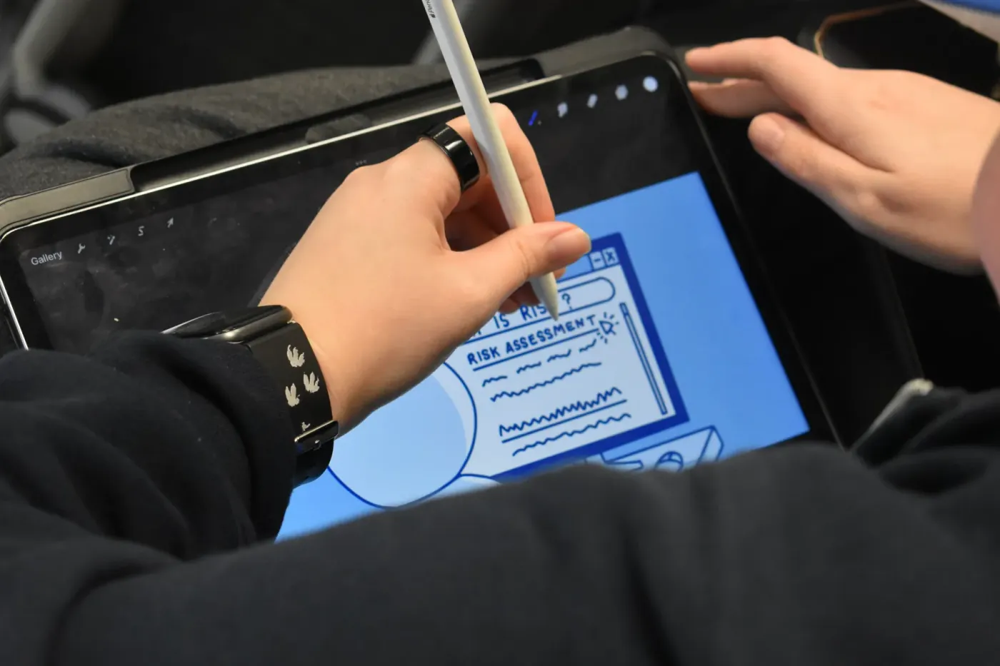
The same principle applied to investors: describe where someone is without ranking them. The early archetypes either sounded like a finance textbook or passed judgment, with the most adventurous profile called The Gambler. I ran a sensory cue workshop where people reacted to digital and physical artifacts for each level of risk, and we listened to the words they used. Through rounds of testing, five characters emerged, each clearly different and none of them wrong. Turn the dial to meet them.
The Character Dial
The Navigator
A balanced guide adept at steering through varying market conditions.
Reads the water and trims the sails as conditions change.
Characters, Not Judgments
- Decision
- Name archetypes as characters with a way of moving through the world, ordered from conservative to aggressive, and never as good or bad behaviour.
- Trade-off
- Names had to be tested repeatedly, because neutral can easily become bland.
- Why
- People who feel judged stop learning. A character you recognise yourself in invites curiosity about the others.
Two Tracks, One Rhythm
Two teams can easily drift into two products. The work was keeping them independent enough to move fast and connected enough to feel like one.
We ran nine weeks from kickoff to the final readout. Each team had its own rhythm, and the leads met across them every week so research, structure and visual language stayed shared. The Accessibility team split again, into a content group owning the guidelines and a design group owning the UI kit.
The Guide: From WCAG to Plain Language
We sorted WCAG 2.1 by its four POUR principles (Perceivable, Operable, Understandable, Robust), kept the criteria that matter for FINRA and finance, and wrote each one to answer the same three questions: what is it, why does it matter, and how does it affect FINRA. Card sorting turned those 52 criteria into a structure people could find their way through.
The Guide's Structure
Guidelines for product and design teams, grouped by the part of the interface they touch.
33 pages in 7 groups- Contrast Minimum
- Non-Text Contrast
- Use of Color
- Resize Text
- Text Spacing
- Images of Text
- On Focus
- On Input
- Consistent Help
- Multiple Ways
- Consistent Navigation
- Orientation
- Content on Hover or Focus
- Target Size
- Audio Control
- Pause, Stop, Hide
- Redundant Entry
- Motion Actuation
- Consistent Identification
- Timing Adjustable
- Error Identification
- Error Suggestion
- Error Prevention
- Captions (Prerecorded)
- Captions (Live)
- Audio Description
- Audio and Video-only
- Media Alternative
- Three Flashes
- Non-Text Content
- Headings and Labels
- Link Purpose
- Labels or Instructions
The Risk Tool: Questions as Stories
The quiz got the same care in its words. Every question was written twice: once as a plain statement to agree or disagree with, and once as a short story with real choices. Testing kept the stories, which read as a moment from life rather than a finance exam.
One Question, Two Ways
“When the market falls, I move my riskier investments into safer options.”
You're sailing and a storm rolls in. What do you do?
Same question, same scoring: each choice maps to the same point on the scale. Only the experience of answering changes.

From Guide to Standard
Testing refined both deliverables. Then FINRA made them its own.
We usability-tested both deliverables with the people they were built for, and every finding went straight into the next version.


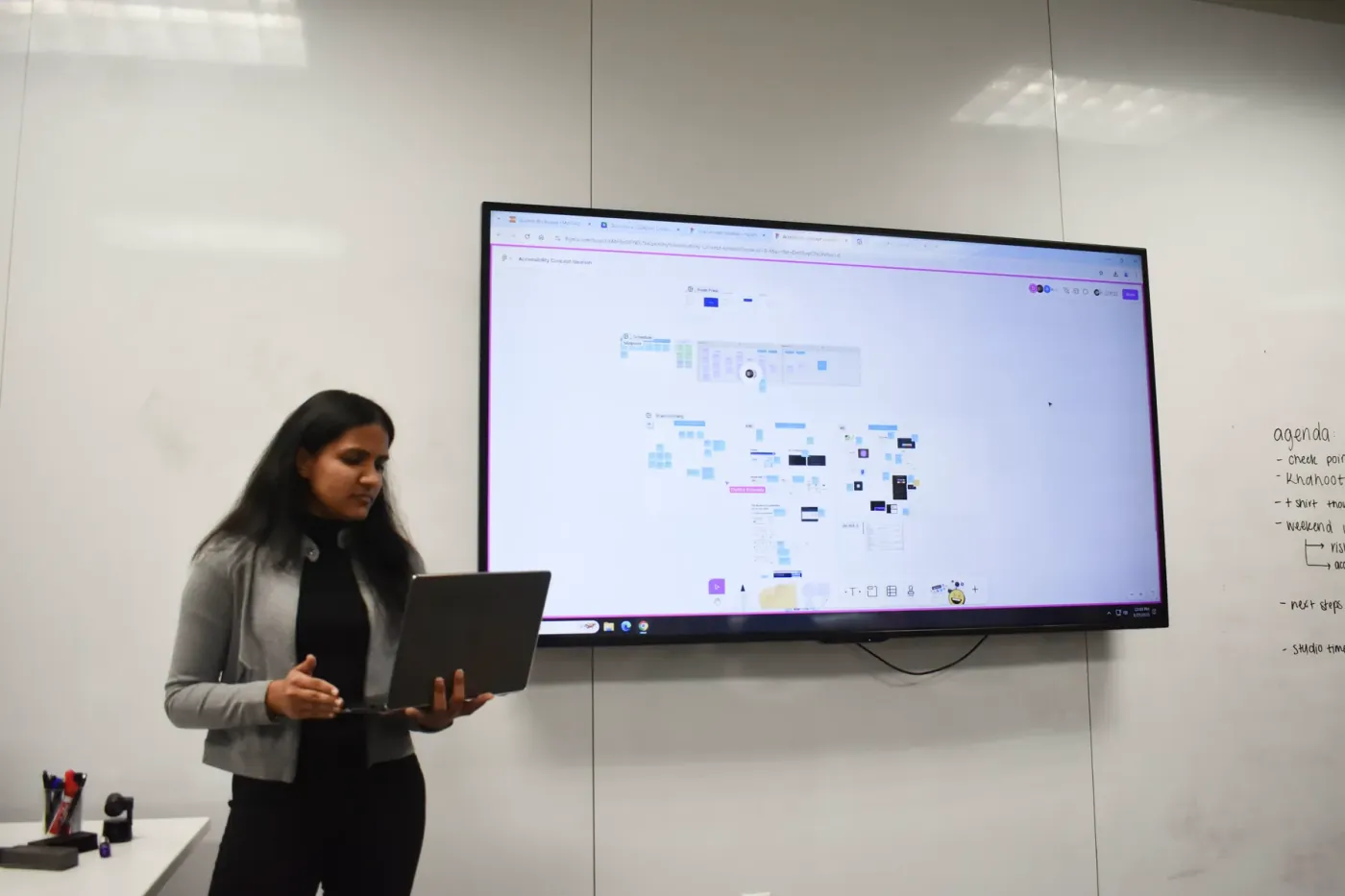
Alongside the guide we delivered a training deck, Building Accessibility into Your Workflow, so teams could learn the approach together: why accessibility is a mindset rather than a requirement, then what to do while planning, designing, developing and verifying a product. We presented both deliverables to FINRA's digital leadership at the final readout.

The Guide and the Tool, Redesigned
The delivered structure, content and flows, redrawn with a 2026 finish: how I'd present both today. Example content is illustrative.
A Guide FINRA Made Its Own
Both deliverables outlived the project.
All
FINRA products now guided by the accessibility guide
0
roles with their own actions in every guideline
0
project stages where a team can start
0
neutral archetypes replacing judgmental labels
FINRA adopted the accessibility guide internally and now uses it across all of its products, so accessibility is something every role owns and every project can pick up, wherever it is. The archetypes reached further than the tool they were made for: FINRA's digital leadership saw them as a new way to describe investors without judgment.
This could redefine how archetypes are named and categorised, not just at FINRA but across FinTech.
What I Learned
Design for the Real Starting Point
Most teams don't start right. Tools that welcome them mid-project get used; tools that scold them don't.
Shared Work Needs Shared Words
Writing each role's part in its own language did more for adoption than any amount of persuasion.
Names Carry Judgment
A label can teach or shame. Testing what people feel, not just what they understand, changed the whole risk tool.